This FEELed Note was written by Emma Carey, Research Affiliate with the Enhancing Access and Inclusion in Environmental Humanities Research Practice Project, in collaboration with FEEled Lab Director Astrida Neimanis.
The main objective of Access and Inclusion in the Environmental Humanities was to learn how to better enact commitments to access and inclusion at the FEELed Lab. Part of this required learning about how access and inclusion guides the work of other environmental research labs and centres.
So, while the access and inclusion project has officially wrapped up, I wanted to tell you about one of the lesser-known aspects of it … the website field scan!
Generally, we wanted to know how other labs were engaging with access and inclusion and what best practices we could draw from. So, Astrida and I looked at the websites of 25 research labs and organizations. This included a mix of environmental humanities, biology, ecology, arts, and environmental justice research labs.
The results of this field scan helped us learn specifically about good website design but also about broader themes of accessibility in a research context. We want to share with you what we learned and how we did it.
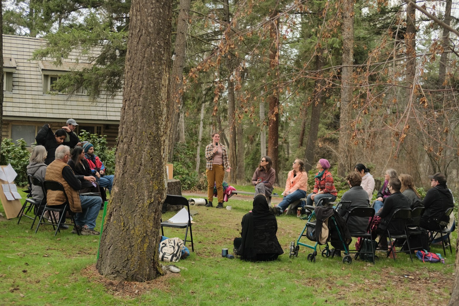
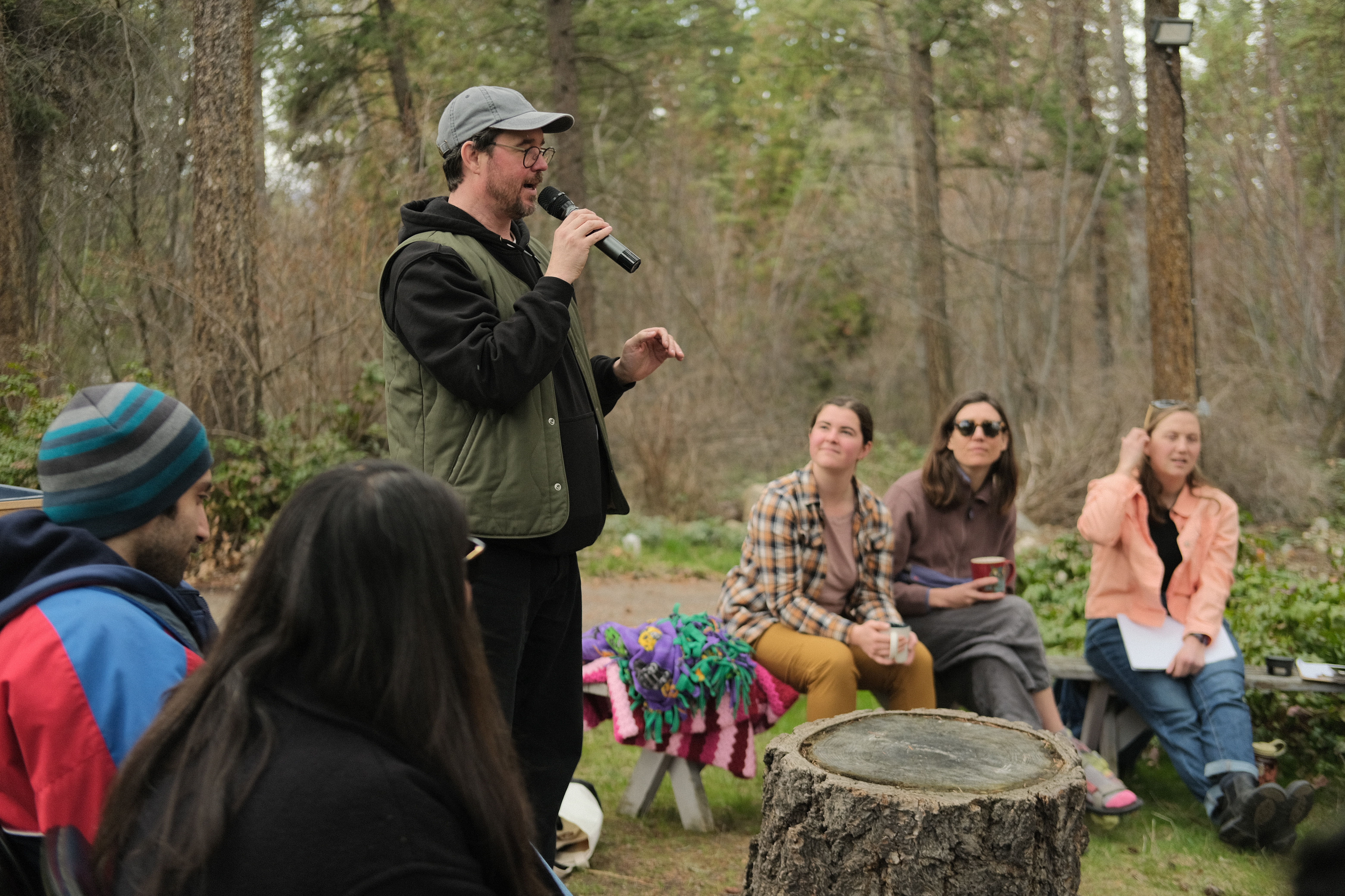
Importantly, we recognized that what a website says or show does not necessarily translate into how accessible and inclusive the practices of these centres are — but they do tell us something about welcome. Welcome was one of the recurring themes in our project: do folx sense that this is a space they can enter — where their needs will be heard and accommodated? How is this signaled (or not) through the “public face” of the website?
We each spent about 30 to 45 minutes on each website on our own, targeting certain pages and searching for terms related to inclusion (since we couldn’t read everything).
First, we looked for a formal or informal policy on access, inclusion, diversity, and equity. Unsurprisingly the existence or absence of an official policy was not always the best indicator of how accessible and inclusive we thought a centre or lab might be — welcome could be expressed (or not) in many other ways, too.
Next, combing through the websites, we paid attention to these questions: Was the navigation of the site easy to understand and use? What was the tone of language used, and what visual signals were given about access (e.g. was a diversity of participants shown in photographs, was there alt-text used for images)? What other signals were given about access and inclusion in stories, programs, bios, funding programs, etc?
As we learned that for websites, there are many ways to bake-in access.
- Clear and easy to use navigation is a must! It’s important to avoid burying pages in sub-layers of the site where visitors cannot find them. Cross-referencing webpages (i.e. including a hyperlink) can help people find what they are looking for.
- Using alt-text for images is necessary. This ensures people with low vision can access all your content. Some labs (like Critical Design Lab) include image descriptions in the visible portion of a website so that more people can engage with them.
- Importantly, websites can be a space to document the process of access and inclusion for research labs. And this can help labs share information with each other.
For more on website accessibility, read Access In the Making (AIM) Lab’s guide. They have many valuable insights into accessible website design.
In addition to learnings specific to website design, we found common themes on accessibility that have a broader applicability.
For example, as noted above, having a formal diversity, equity, and inclusion (DEI or EDI) policy does not always mean an organization is fulsomely engaging with access principles. When DEI is about performativity rather than substance, access is treated as an optional add-on or a checkbox to tick.
Many well-intentioned organizations suffer from this approach! Gesturing Towards Decolonial Futures, an arts/research collective, has an amazing blog post about this very issue.
We often found more evidence of deep commitment to access from organizations with informal policies, especially small labs! Access was interwoven in research design, implementation, and knowledge sharing. A good example of this is UBCO’s Institute for Community Engaged Research (ICER).
Yet, formal policies are still key sites for access since they allow an avenue of recourse if someone is being treated poorly. If you are lacking any kind of access policy (formal or informal) as a lab, this needs to be improved.
In addition to policies, we found access in a university setting includes thinking critically about barriers to academia for students, researchers, community partners, and visitors. Indigenous Lab & Data Stewards Lab writes on the necessity of decolonizing universities. This includes creating data governance protocols (how data is treated before, during, and after research) to prevent exploitation of Indigenous Knowledges. Access In the Making thinks particularly about barriers to academia for people with disabilities.
Barriers to academia include financial barriers, so offering bursaries and scholarships to students is one key way to counter these barriers. Also, students also need specific spaces to showcase their voices on lab websites, which helps them cultivate valuable communication experience. (For example, in writing blogs like this one!)
Academia can be an intimidating place, so cultivating a sense of welcome is a must (there’s that keyword again!). The website for Dr. Chase Mason’s lab at UBCO, a plant physiology and genetics lab, uses welcoming language directed at prospective students. Indigenous Land & Data Stewards is another exemplary website that fosters welcome for students.
Including pronouns for team members on a lab’s site can also create a sense of welcome for trans students and researchers. Critical Design Lab, an arts and design collaborative rooted in disability culture, uses this method.
In our field scan, Astrida and I found many labs implementing access and inclusion principles. But there were often gaps. Some labs lacked discussion of Indigenous land rights and settler colonialism. This factors into cultural safety for Indigenous students, researchers, and partners.
Other labs didn’t seem to include anti-ableism in their thinking on access. One consideration of anti-ableism is ensuring people visiting your lab know in advance about the physical setting of the lab. This can mean including a physical description on your website, with accessibility info for people using canes, walkers, and other mobility devices. If there are stairs to get into the lab and no elevator access, be sure to tell people this! Look at Feminist Media Studio and AIM’s websites to see how they do this.
Along with the setting of the lab, be sure to set expectations about how the lab is run through the use of protocols. Protocols can be used for how lab meetings are run, for how to join and leave the lab, and for the level of physicality of lab work. Civic Laboratory for Environmental Action Research (CLEAR), a marine sciences lab in Newfoundland, is a leader in their use and development of protocols.
As part of the access and inclusion project, the website field scan helped us gather some threads of what other labs are doing. We hope you can take inspiration from our findings and apply them in your own life and research.
